Visualising spatial data
Posted on Aug. 14, 2014, 9:15 p.m. by Emma Tonkin
(Comments)
In earlier posts in this series, we covered the geocoding of French locations and discussed the shape of the resulting dataset. To recap briefly:
- Place entities are resolved into a geographic point. We do not at this stage consider the boundaries or area of a given region; we simply look up the centrepoint of the region in question in a large lookup table and, metaphorically, stick a pin in the map at that point.
- The coordinates of each point are stored in WGS-84, which is something of a lingua franca for display of spatial coordinates. Therefore, it is possible to use the coordinates directly in software packages such as Google Maps and OpenLayers.
- Many place entities appear infrequently; a small number of place names appear very frequently.
- Overall, we have a large number of individual data points, but many of them refer to the exact same point on the map.
In this post, we will explore some approaches to visualisation of this data using the statistical computing software package R. These examples will use a set of French location entity instances, based in the Bordeaux region.
Plotting coordinates on a map
Let's start by plotting the coordinate set directly onto a map. We will simply fill each occupied point with a red dot.We will also draw in the political boundaries of France and neighbouring countries as they exist today, using the rworldmap library. It is true that historical boundaries may be more informative, but in general, visualisation packages are intimately tied to the geography of the present day. For the time being, at least the use of present-day shapefiles (that is, geographical data files describing the vector graphic that forms the boundary of a given geometric shape (country, county, lake, river) provides us with an entry point into the visualisation.
We run the following code:
library(rworldmap) # use the rworldmap library
newmap <- getMap(resolution = "low")
# get a world map.
# Keep the resolution low; the higher the resolution, the larger the file
# and processing time (but better quality output)
plot(newmap, xlim=c(-5,9),ylim=c(44,52), asp=1) # just plot France and a bit of England and western Europe
data<-read.csv("place-data.dat", header=FALSE,sep="\t"); # Read the file from CSV
colnames(data) <- c('cal','lat','lon'); # Retrofit titles onto the data file
points(as.numeric(data$lon), as.numeric(data$lat), col = "darkred", cex = .1)
dev.off();
There; we've plotted the data points onto a graph. The output looks like this:
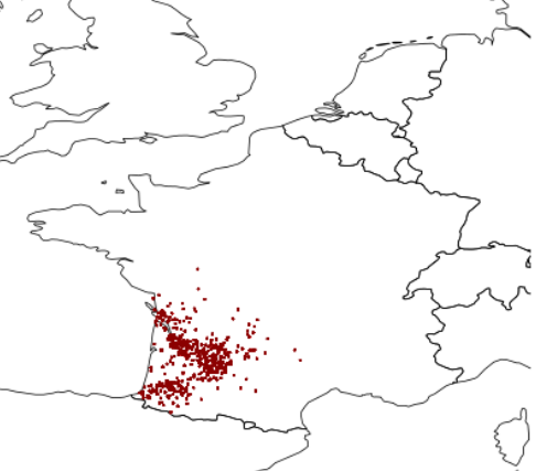
Periphally, it looks reasonably appropriate. There are a few minor issues; for example, there is a point rather too near the sea by La Rochelle. There are two likely reasons for that:
- The shapefile drawn in the background does not include detailed mapping information and it would appear that the Ile de Ré, for example, is not included at this level of detail (recall that we intentionally avoid working with highly detailed maps).
- The transformation between Lambert and WGS coordinates leads to arbitrarily high accuracy; we chop it to 2 decimal places to keep the filesize down. This no doubt leads to a few minor inaccuracies.
There's a third problem, too, although it is not obvious solely from looking at this map. It is this:some of these points have thousands of pins stuck in them, but most have just one or two.
The Robin Hood problem
Computers are perfect marksmen. If a computer is asked to stick a point in a map at a precise point, it will do exactly that. As a consequence, where multiple coordinate sets refer to the same point, this visualisation does not show the frequency of references to that point. It draws the same image whether one record or a hundred thousand records refer to a given point.
How should we fix this? One solution offered by R is the jitter() function, otherwise known as jogging Robin Hood's elbow, causing him to miss on purpose. Yes, this adds a small variation to the coordinates plotted, resulting in a random spread (Gaussian or normal distribution) around the targeted point. This is unlikely to be beautiful (we have essentially smudged the ink on the map) but it will give us a better idea of the true density of points on the map.
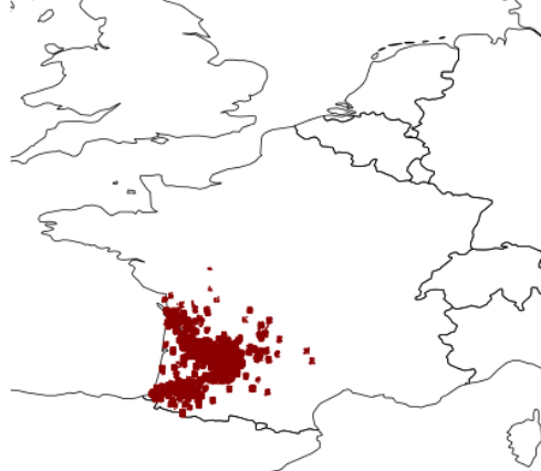
In one sense, this is a great improvement: it gives a better idea of the density of points identified. On the other hand, it is clear that the number of data points is overwhelming. Additionally, the sparseness of the underlying map tile is visually boring and uninformative.
Mosaic tiling
If, instead of using dots, we tile in sections across the map (like a mosaic, using colour to symbolise the denseness of coverage of the area), we can use a semi-transparent overlay over a detailed map of France. For this, we use the ggmap library instead of rworldmap.
library(ggmap)
library(RColorBrewer)
pdf("mapped2.pdf",width=10,height=10);
map<-get_map(location='France',zoom=6); # get a detailed map from Google Maps
# load data as before...
chart2<-ggmap(map) #print out the map
chart2<- chart2+geom_tile(data=instancedata, aes(x=round(lon, digits=1), y=round(lat, digits=1),
     fill=log(freq)), alpha=0.7, contour=TRUE)+ scale_fill_gradientn(colours=brewer.pal(9,"OrRd"))+
     guides(fill=FALSE) + theme(legend.position="none");
chart2 # print out the chart
dev.off() # close the file
Using an orange colour scheme (the 'OrRd' colour scheme provided by RColorBrewer) the result looks like this:
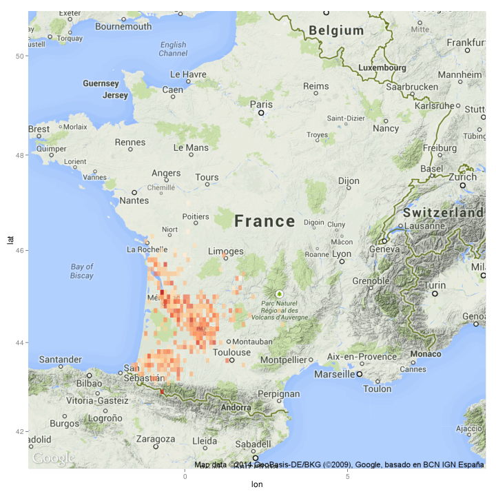
From this more detailed map, it is possible to see that one of the most densely referenced (reddest) areas is the centrepoint of Bordeaux.
Share on Twitter Share on Facebook comments powered by Disqus